Tuesday 26 February 2013

Rodchenko

Aleksander Rodchenko

Born on 23rd November 1891 in St. Petersburg, Aleksander Rodchenko was to become a huge part of the Russian constructivism movement and created art for a reason, with a purpose and not just to sit there and look pretty mainly to be a symbol for something important or to convey a certain message. Alongside another great artist of their time, Liubov Popova they began to re-form and re-shape Russian art for the future generations to come.


Rodchenko was a very skilled and educated individual when it came to art, he studied a wide range of artistic subjects. He studied applied arts in Moscow, he helped found a museum and become the first director, he also taught high grade art, illustrative work in theatre included costume designs for many theatres... here is an example (to the left) of one of his designs for a play called "The Princess Padua" in 1914, his designs are emotional, dark, detailed and unusual.                                                                     , films typography and advertising, provided cover designs, photography was one of his passions, shot afew short movie reels, photo reporting and as you can see the list can go on and on... so it is clear to see that he is an experienced expert when it comes to things to do with art.. even in his first job (an assisstant to Tatlin at a 1916 futuristic exhibit in Moscow) ten of his pictures were shown there at the exhibit, so even at a young inexperienced age his talent was quite apparent.


But the most outstanding and most recognised of his work are usually his posters because they have their own style, he uses very few simple colour techniques, he only uses block colour usually no more than 3-4 on a typical poster. This image to the leftis a very well known poster of his that has been re-done/ re-coloured/re-designed so many times by so many artists... the simplicity of the piece is effective with the bold block lettering and the use of words in the design that they are in start to become part of the image itself instead of just being plain writing ... this was believed to get the message across and captivate the onlooker of the poster into reading what it has to say because ultimately it has become more interesting- these sort of posters were used for many things in Russia eventually by the government simply because the message was conveyed more clearly by the way the writing was displayed.. people obviously wanted to read it and eventually was used as propaganda, advertising, and much more...


Monday 25 February 2013

Townscape research print!

Ewa Kienko Gawlik- I have researched her work in the past for her beautiful figure paintings and drawings- she is a very talented artist from Poland and is very much focused on the female body which is clear to see when you look at these drawings of "old streets" which she seems to like to do every now and again.. They aren't very detailed and look like they haven't had much time spent on them but they have a charming quality that is continued throughout her townscape images...


This image wouldn't be as good if she hadn't have made the darker areas that dark, it adds more of an eery atmosphere to go with the dark road that is slowly disappearing down the page.
This is probably one of the more detailed of her townscapes and even this isn't that detailed.. I like her use of the perspective and the single dark character in the distance it gives the image a more mysterious atmosphere, and I love the selected detail in the cobbled walls and I can only describe it as cute. I love the rough lines of shade she has used in the corners of the walls and floors...


I think this image is lovely, it's not exciting but it's got great atmosphere. The bare tree and fairy lights make create the illusion of winter or cold weather and the oranges, reds and browns warm the image up. The image is cluttered with restaurant imagery,notice boards, tables, chairs, cute little signs in the windows and this makes the image feel all cosy and homely which I love. As I said it may not be the most exciting but It's a simple painting with a clear and positive atmosphere. I found this painting on a blog, it does not say who painted it, what it is called or any other information but I really like this image.

http://marimbamonkey14.deviantart.com/art/Batman-on-Hallucinogens-60921736      <--- has townscape artist on it !!!

Comic Female Art

I absolutely love the way women are drawn in comic books... over exaggerated facial features such as eyes and lips and overly curvy body shapes, the colours are usually vibrant and colourful and they're always beautiful. I have always practisedrawing them, drawing doodles and also very detailedrawings of comic book heroins or characters that have either been completely made up, based on a character or has elements from other characters that I have taken inspiration from...
For example.. here are a few examples of my work and the inspiration that lead to them...

First example: 'Ice cream lady'
I created this image myself, the facial features are based on an image of myself but I have cartoonised them and added my own creative flair by transforming the hair into ice cream. The whole body was created from scratch as you can probably tell because most of it isn't correctly proportionate to the head or other parts of the body but I love this image because it is a creation of my own, I love the ice cream hair and the polka dot bathing suit- it's a curvy girly image that reflects what type of things I like to draw/ create etc... it reflects my personality in a way and that's what I like about it. It's simple but effective and creative and also an example of a self createdrawing of mine inspired by the comic book heroin world...


This is an example of a drawing of mine (can be found in portrait book) where I have used multiple origins of inspiration as 'poison ivy' is a very popular marvel character so therefore there are many images, drawings, variations of her and I have collected little pieces of other images and used them on my own... for example the costume, hairstyle, facial features and body pose would be little pieces of other drawings that I like the look of and would use the technique or shape and change them slightly to create my own little variation of her... some people think this may be boring or unoriginal but I like this experimental way of drawing and getting everything perfect so that I can create a curvy, sexy, big eyed, big haired comic book style woman in my own way and I like my way!... Here are some variations of poison Ivy that inspired this piece and some artist information to go with them: 
This image of poison Ivy gave me the costume designs for my image, I added more detailed leaves I think and changed the belly piece but kept the same shape around the breast and leg areas... also I thought her eyes where beautiful so I added the same sort of shading around mine and the vines around the legs and arms... making sure I don't actually copy anything but definitely inspired by certain pieces such as this one by an artist I found on my favourite website "deviant art". This artist specialises in professional digital art andesigns these images to be used on websites games and computers and was born and bred in Hong Kong- his main focus is on female characters such as this poison ivy portrait that he has created on his special digital art software and he also creates many other comic book heroins/ villains such as this one..
This is "Black cat"- drawn with copic markers it is a beautiful example of the specific type of images that I like to draw- Images of beautiful comic book women.


Here is another example of a drawing of mine, I don't have any of the drawings that inspired me- I didn't save them because this is a very oldrawing but what I can tell you is that it was inspired by a character that I used to read about in comics when I was younger but I can't remember the name of the comic book! She is based on a magician assassin, a villain from an old comic book. I've called this piece 'Martina the assassin Magician'
(This image can be found in portrait book)
It was drawn with graphite pencil, charcoal and small hints of black pen, I remember changing the body shape, outfits, hairstyle, adding in the wand and playing cards and the face is based on angelina jolie (even if it doesn't look like her)... It's considerably mis- shapen and wrongly proportionate and the shading is dodgy but I like this image... I have found some images that link to this subject that are similar to this image.


The images above are similar to the character out of the comics I used to read and are the most similar images I could find to the ones that inspired me to create Martina... They are detailed, beautiful, there is alot of magical imagery, harsh dark lines and tones accent all the necessary features that make these images perfect. They were created by an artist called Marcio Abreu and where found on deviant art.. he is a professional traditional artist who creates comic pencil drawn images such as the above he has worked in titles such as Grimm fairy tales and other big titles... he is from Brazil and is a very talented artist creating thousands of images over the years similar to these which are quite clearly my favourite style to draw in.... 

Thursday 7 February 2013

Illustrator (Graphics lessons)

Graphics Illustrator

Firstly, before even starting anything on illustrator I named my first layer "template"- and on this layer I placed my townscape image that I planned to work with (an image that I took myself) and changed the setting of the image "template" and reset the brightness on the image so that I could draw over it and remove it when finished- making it easier for myself to draw with the computer. I then locked the layer as you can see on the image to the left so that I don't get confued with the layers.


Then I added a second layer strictly for drawing on so that if anything goes majorly wrong I can always restart by clearing the layer- I have named this layer "outline". which I haven't locked because I'm still working on and something could go wrong at any time...

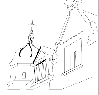
Pen tool Then we started working with the pen tool... this tool makes drawing in large areas easier to work with- instead of drawing freehand you click on your starting point and it "anchors" which is the point you have to return to by the time you have finished drawing your shape....
This is an example of the start of the illustrator drawing- as you can see you have to draw around whole shapes like this- which is easy once you get used to it... Its just the simple outline before adding any detail at all.. I think the pen tool is very handy asd it requires no real skill- the programme does all the work for you.


The images above are examples of my pen tool work- mainly outlining the larger shapes and getting an essence of the real image underneath... It was really hard work getting the smaller shapes to the right size and shape so most of them are wonky or mis-shapen and can't be fixed because the lines get confused when they get to close to other points/anchors... I will remember that for next time..


Blob tool:Then we started learning about the blob tool (3rd one down on the image to the left) which allows you to paint in neater shapes... for example if you wanted a curved line you would draw your best attempt and the programme will edit it so that the edges are sharper and more defined and resemble a curved line more... it is a very easy tool to use.


Here I edited the blob tool to the size that suited me best, the smoothness, shape size angle and roundness .. I did this afew times when the brush needed to be smaller to paint the smaller areas.
The image below is the menu colour for the blob tool, I changed it to a grey colour part way through my drawing to add some shade to the mroe defined lines..
Here is an example of my work with the blob tool- as you can see it's not very good- I need to get used to it and also, the lines are too big but small detail is hard to do with the blob tool or any other tool really because the mouse restricts your movement unlike a hand it's very inaccurate
I could have done better but the template was too faint and I couldn't see any finer detail....


It's not very detailed and I didn't use the blob tool much but it has a strange quality about it and I can't tell whether it's good or bad...


This is what my drawing looks like so far without the template behind....... Before and after...


Here I have created a new layer for 'brush work' which is the new tool I will be using to add more detail to my drawing. This way I can easily remove all brush work if I decide I don't like it.

Here is the route to the brushes I have started to use, there are many types and styles to use but I like the look of the artistic brushes better- you have the selection between a various range of brushes such as ink, paintbrush, charcoal etc... 


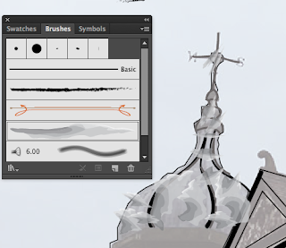
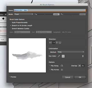
Here is the menu that shows the 
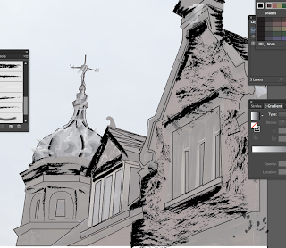
different shapes and styles that the brushes creates to give you an idea of what the brush stroke will look like which I think is a really good idea. As you can see on the image behind I have decided to use the watercolour brush to add this unusual effect to the dome... It's abit out of the lines and oddly shaped in places but I like the way it looks- it gives it a more 3d effect and it was an easy brush to use.. I quite enjoyed using this material....
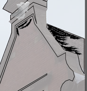
Here is another example of my brushwork- this time I have chosen 'charcoal' to add abit of shade and tone onto it which I found quite easy to use, erase and play with... It's a creative tool that can be used for many purposes and at the start I was only experimenting with it but it looks so nice I've decided to keep it and add it onto other various places...
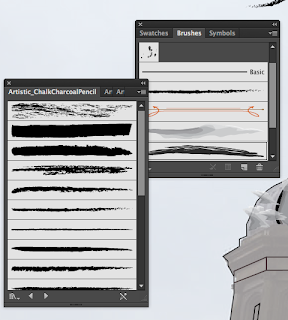
And here is the menu of the different shapes and styles of charcoal that can be used I experimented with quite afew of them and used others simply because they were smaller and created a more detailed effect... this menu made the tool easier to use as you can click and use straight away which I think is brill.

Here is a screenshot of my drawing so far, it's not very detailed, not very accurate and I don't really like some of the effects that I have used but I think the drawing would look too plain and I wouldn't like it... I think this image could look better but I would have to start all over again...
here is the menu for the tool brush, it'f for all the main settings for it such as brush scale size, strength of tool, direction as you can see it's very useful if you want a specific brush type. I didn't really need this menu but it was good to know that if I did want something specific then I would know where to look.