Monday 10 December 2012

Inspired by research artists

Edward Weston


Jan Groover


Life drawing...


Rebekah, My little sister.
 Tonal drawing quickly done in 20 minutes (because she wouldn't keep still!) It's not very detailed and the shirt isn't shaded but it makes the image more interesting.


Hannah, Friend


This is a life observation of a friend.. It's detailed and I took alot of time on it, it's more realistic than the others even though there isn't any heavy shading, it resembles her very well and also, it was easy to draw because of her unusual pose. Oringinally I drew my friend Dylan next to her aswell but it went badly wrong so I cut her out.


Me as a young child
 This isn't a life observation but it is a self portrait of me as a child, drawn from a photograph... I have only kept the main features of the face not really adding any face shape or line definition to the face shape, there is minimal shading which makes it good to edit, add to or change and it simply detailed with no heavy tones apart from on the eyes so your eyes are immediately drawn to them. I really lie this image as I've added my own original flair to it even if it is in a small way.


Dylan, Friend.


This is a life observation of my friend Dylan, I made a really big mistake when I did this- The nose/ cheek area isn't shaped how it should be because when I started drawing her she wasn't smiling so that she didn't have to smile for long and when she did eventually smile it changed her whole face which has left my drawing looking rather unusual and in my opinion, has ruined it. Theres alot of small detail that took ages to do with cross hatch effect and small areas of bold lines and dark shading. It doesn't look very detailed and it isn't very realistic enough- it looks like an animated character and I really don't like it. But I'll remember my mistakes for next time.


Life drawing of a puppy


This is a life observation of a puppy- even though it isn't human it's still observing life. It was easy to draw because the puppy was asleep and only took 10 minutes with a 4h pencil on white cartridge paper.


Life observation of Nicole from class


 In class, we took turns modelling for the class in 15 minute sessions, which meant we had to get it done quickly. This is my drawing of nicole from the side- It resembles her but could be imrpoved if I had more time on it.


Life observation of Alex from class


This is another class drawing of Alex, I didn't have enough time to draw the mouth or detail from behind the glasses or ear but I think it looks very original. There isn't much shading and it is far from finished but I think it looks fine the way it is.


Bird Skull study

Self drawn image of Bird skull to practice the anatomy of the bird skull, drawn with  4b, 2b, and 6b pencils on white cartridge paper. I really like the detail inside the eye socket but the shading could be improved. Also, the top of the skull is mis-shapen and could be improved.
This is my drawing of a much smaller bird skull, It's very detailed and behind in very small, faint pencil lines is the skeleton of a bird... this was not needed but in my opinion it makes the image alot better and adds originality. The shading could be better and the eye socket on the far right is abit dodgy but I like this drawing.
I created this image of a bird skull on the sewing machineIt is a replica of the image below but changed arou nd abit. There is no shading and I have used black sequined material inside the eye socket and the mouth area and it really goes well with the dark green thread. I have made some of the lines thicker in some areas to define them, add shape and make the image more interesting. It's a really original take on a bird skull.


My really simple point and like drawing of a bird skull, with line definition and no shading it's simple but effective.
Quick drawing of a larger bird skull, I don't really like this drawing very much- I rushed it quite abit which makes the shading look shabby and inaccurate. Some areas aren't proportionally correct and it's not very detailed.

Portrait in textiles


This is an image of me as a child that I have drawn... it only has the main facial features, minimal shading and bold eyes... in my opinion this drawing is perfect for editing as it wont be difficult to change or add to. I am going to try and re-create this image in textiles with sewing machines, other materials and embroidery and post pictures of my weekly progress.......................................... 


WEEK ONE. 

 Firstly, as you can see, I have quickly (and not very carefully) sketched the outlines of the image onto a piece of fabric- I haven't spent much time on it because it's most likely going to be covered up/ sewn over etc. Then, for the hair and the eyebrows I have used the felting technique- collected bits of felt and attatched them with a felting needle. Also, I found some green patterned material I could use for the eyes and sewn then on and also attached more felt for the pupils with will make them look more 3D. I like the hair and eyebrows, The felt makes the hair look more realistic which I really like..


Friday 7 December 2012

Book Cover

Firstly, I had to create an image in photoshop of my portrait that aso reflects my personality but is also edited in photoshop. I started off with this image.


 Here I have added a filter, selected certain areas and changed the colours for example i selected the area in the top left hand corner and changed it into a block colour of grey, and also other areas around the background i have selected and changed the filters into charcoal for example and changed the colour. To select certain areas I used the magic wand tool and changed the filters. I really like this filter, although it takes away the detail Its a really nice effect and you can clearly still tell that it's me.
Here I have done the same with the above but experimented with more red in the background. I don't like this one has much I feel as though I have taken away too much detail...


I then decided I didn't really like the image whilst edited, so I decided to keep the original image in the centre and add other photos around it to reflect my personality with images of family.
This is the image I created for the front cover of the book. I used the clone tool to add the images of family behind the centre image then blurred around the edges as an unusual effect. I improvised as I went along and ended up with this image that I really like because it really reflects my family orientated life and i liked it so much I immediately decided that this had to be my front cover...


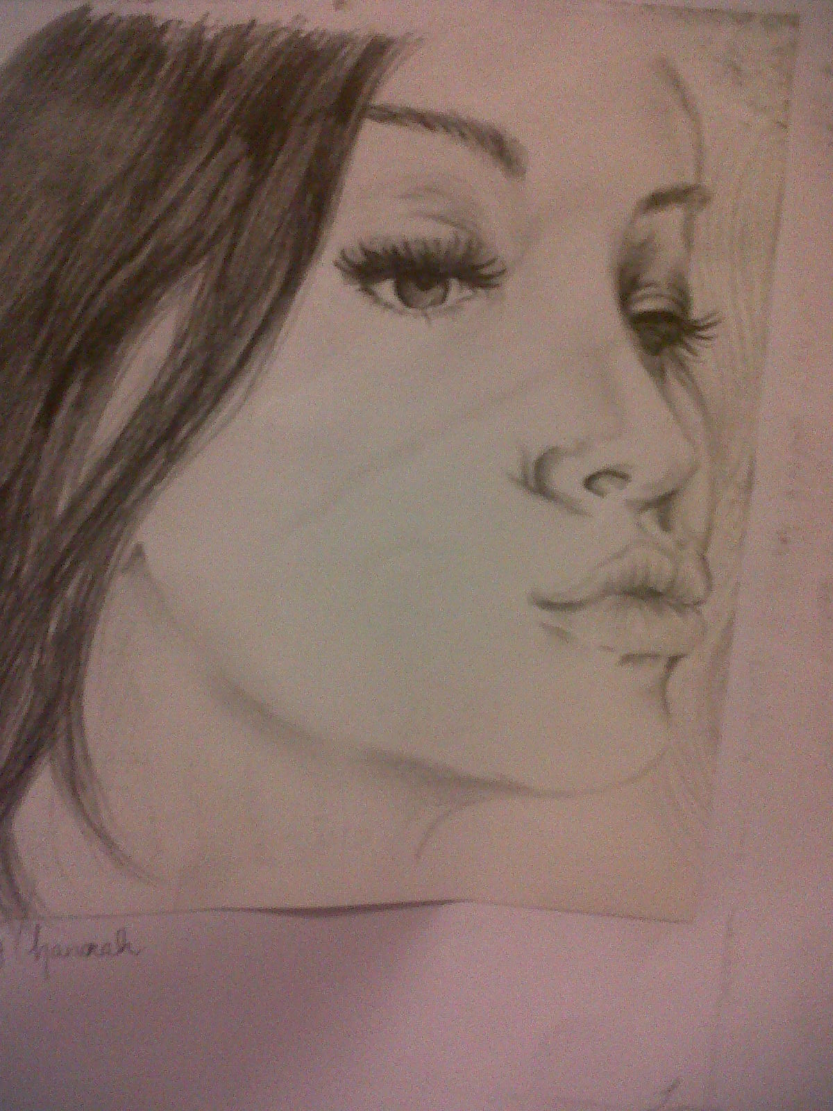
 I scanned this image onto my computer- it is a self drawn portrait and I have used it for the back of my book because it reflects my personality and love of art and decided to use this because I didn't scan in a drawing for my front cover...

This is another self drawn image that i have cropped and inserted to the cover of my book just to add abit extra to the front cover to make it abit more interesting and also because I really like this drawing..


I have saved the template for my book cover to the computer and opened it in photoshop, I then added all the images and text to it and this is the end result...
 This is the book cover finished but without text.... Its quite plain but i really like it- theres black and white and colour which I think is quite dynamic.

This is the finished result; I have added the title 'MY LIFE' in dark bold simple capital letters because it;s short simple and straight to the point, and also added it to the spine along with my name and for the blurb I just added some fake quotes by celebrities and a simple quick sentence about my imaginary book. I think the finished result looks good- it's very me.


If I was to do this project all over again I'd probably use more techniques on the finished piece, although I didn't really like most of them I feel as though the book cover would have looked more creative if I had used more tools/techniques etc. Secondly, The cover lacks color... If I were to do this again I would definitely add some photoshop effects onto the scanned portrait image on the back to create something interesting to look at at the back... Also, my original thought was that bold black writing would be more effective but I'm starting to think I could have at least changed the font into a nicer maybe even fancier font and possibly changed the color because it seriously lacks color. But I do really like my finished piece I think it reflects what kind of person I am and that was the main aim really, the images are interesting, there's not too much writing and everything is in place and went to plan so I am perfectly happy with the result even though it could be improved.


Photoshop bird skull

Starting Point
This is my drawing of a bird skull drawn in pencil as part of my research in still life and this is the image I have chosen to scan to the computer and edit in photoshop. I used a canon scanner to upload it to 'image capture', saved it to my area and uploaded it in photoshop.


 In photoshop I changed the image size to 150 dpi so that it's the perfect size to edit, layer etc, if i was going to upload it to my blog I'd change it to 70dpi and if I wanted to print I'd change it to 300dpi so that the image is detailed.

Here are some images I have done on photoshop using a number of different filters, effects etc.


 The patchy effect on the background skeleton has been done with the wand tool, The scratchy effect has been done with the pen tool and I faded the layer with the drawing on so that the purple layer from behind shows through which I really like.....


 I have added a charcoal smudge filter to this image and darkened the brightness but kept the same purple background and scratchy effect as the image before and also experimented with more colour into the skeleton behind.


 In this image i have exoerimented with brightness and colour, greens and purples with more pen around the skull.


Here in these images below are a number of filters and colours that i have experimented with and I think they look really good....


My dry point printing.

dry point printing is a simple process like drawing using a pencil/pen but with a dry point such as a needle to create an impression on a material such as a plate, tile etc that can be printed from- this can look very effective, ink is then placed onto the plate/tile then cleaned so that ink only remains in the cracks. The plate/tile is then put through a printing press where the ink is printed onto paper/card etc..

I scratched my design into a plastic tile with a dry point tool and produced my portrait with a scratchy quality. I also messed around with coloured ink, red, blue, green, purple ad black and when they dried I added to them with pen, highlighter, ain't etc. Here are some examples...


 This image was printed in black ink but the image wasn't detailed enough so I added to it with black pen onto the hair, shading and cross-hatching around the edges for extra detail- I really like this effect.
The image didn't scan very well- in real life the yellow and green areas are more prominent and are in highlighter pen. This effect looks really good. Also, I like the dark ink that has smudged around the edges.


 Whilst printing this dry point print I applied different coloured inks to certain areas to create a colourful image- Unfortunately, this didn't work. The green is noticeable unlike the blue in the hair and red in the lips and looks very out of place, It looks boring and not very detailed. A way to improve this would have been to do it again but leave more of the ink left on the plate so the colours would be bolder and the print would be more interesting to look at.
 In this print I left the ink applied in the darker areas that you can see to add some sort of tone/ shade etc.. It has worked well and I am pleased with the outcome. On the other hand- in some places it looks very smudged which makes it look shabby and rushed so maybe it would have looked abit more professional had I have cleaned the smudges off before printing.
I really like this print- It looks like an under developed photo from an old camera. I left the smudges there on purpose to create this effect simply by not fully wiping all the ink off properly and it's paid off well.

This is one of my favourites.. It reminds me of them drawings you would see in very old books where everything was printed in black and white and the drawings all had a scratchy dark quality. This print makes it look as though there is a light shining on the face in a dark room and the result has a very dark, Gothic quality. I wouldn't change anything about this print

Thursday 22 November 2012

Examples of Inspirational dry point prints


 This is a dry point print by Picasso who is well known for his distortion of faces, people, images etc and I couldn't have found a better example of print to use than this. It's beautiful, he's used scratchy cross hatching to create tone, shadow and face shape, circular shapes all come together to create the head and even though it's distorted the features are all recognisable. I really like the cross hatch effect and the detail in the lips, and also the change from the light at the top of the print to the dark shadows at the bottom, she looks very angelic and peaceful and there is a huge essence of Picasso about this print that is very familiar which is why I think this print is successful. The print is called "head of a woman" which is less elegant, created in 1933 and finally printed in 1961 by Jacques Frelaut. 

This is also a picasso print, I struggled to figure out what it was at first which personally, I don't think is a good thing! It reminds me of a spider web and I find it quite creepy but I appreciate the time and effort that has clearly gone into it as it's a very complex piece of work. It is a picture of two women sitting down- and is another distorted image. I have chosen it though because it is a beautiful piece of art (whether I like it or not) and has a very original and unique style... It is called "Two seated women",created in 1938 and printed in 1961 yet again by Jacques Frelaut.


This image is by Ribera who only made eighteen dry-points and etchings between 1620 and 1628 whilst working in Naples to boost his career. I really like this print not just because of it's beautiful detail but because it has a little story behind it. It is an image depicting the demi-god son of Pan, Silenus. Silenus was a poet, drinker and leader of the Satyrs (the half goat half men in the background). Silenus would roam the countryside with a crew of Satyrs & Fauns drinking and causing mischief and chasing Nymphs, the donkey in the image is significant as when Silenus was too drunk to walk he would ride on his back. <-- I think this is a fascinating piece of history and myth as well as a beautiful print. I love the way he has captured the simple broken- down background and surroundings and yet, Silenus has an aura of elegance and luxury about him. the small detail and the shadowing is amazing and the expression on Pan's face is so life-like, aggressive and evil... even though I'll not be able to re-create something of this standard it still remains an inspiration. This is an etching with drypoint and engraving, created in 1628 and the original size is 272x350mm.

scratchy cross- hatched effect is lovely! I'd like to use it in my print..


 This image (Rainy day Queens) is almost like a photograph because it is that detailed! It's absolutely beautiful! The tall characteristic buildings of Queens, New York the dark sky should look miserable... but Martin has left a huge chunk of light in the sky that is almost heavenly and makes the whole picture very idyllic, calm and quiet. I'm amazed at how perfect he has got the reflection of the light in the water and puddles, the woman at the front and the sleek lampposts make the image look classy and the cratchy rain is a really good effect to use.
By Martin Lewis


Angie Hoffman:
Angie has this incredible effect of doubling the image again underneath her original which is simply brilliant, her images are comic-like but are still very detailed. There isn't much shading but it is still a very effective image even more so because of the dark background against the pure white of the skin.